R: 4.3.2 (2023-10-31)
R studio: 2023.12.1+402 (2023.12.1+402)
1. Segmentation data
• 年龄(age)
• 性别(gender)
• 收入(income)
• 孩子数量(kids)
• 是否拥有或租赁住房(ownHome)
• 当前是否订阅所提供的会员服务(subscribe)
> seg.df <- read.csv("Data_Segmentation.csv", stringsAsFactors = TRUE) |
1.1 Recode factor into numeric data
> seg.df$gender <- ifelse(seg.df$gender=="Male",0,1) |
1.2 Rescaling the data
> seg.df.sc <- seg.df |
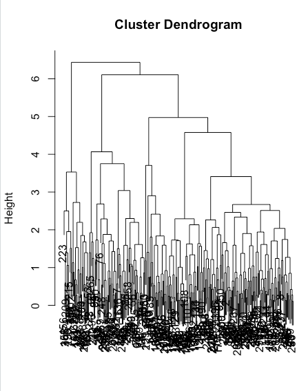
2. Hierarchical clustering: hclust()
2.1 Distance
> seg.dist <- dist(seg.df.sc) |
2.2 Clustering
> seg.hc <- hclust(seg.dist, method="complete") |
hclust(d, method = “complete”)
-
d:数据的距离矩阵或相似度矩阵。距离矩阵是一个对称矩阵,其中每个元素表示两个观测点之间的距离。相似度矩阵也是一个对称矩阵,其中每个元素表示两个观测点之间的相似度。通常可以使用 dist() 函数计算距离矩阵或相似度矩阵。
-
method:指定用于计算簇间距离的方法。常用的方法包括:
- “single”:最短距离法(single linkage)。
- “complete”:最远距离法(complete linkage)。
- “average”:平均距离法(average linkage)。
- “ward.D”:Ward’s 方法,通过最小化簇内方差来合并簇。
hclust() 函数返回一个树形结构对象(dendrogram),可以使用 plot() 函数对其进行可视化。通过调整 method 参数,可以控制聚类的方式以及簇间的相似性度量。
> plot(cut(as.dendrogram(seg.hc), h = 4)$lower[[1]]) |
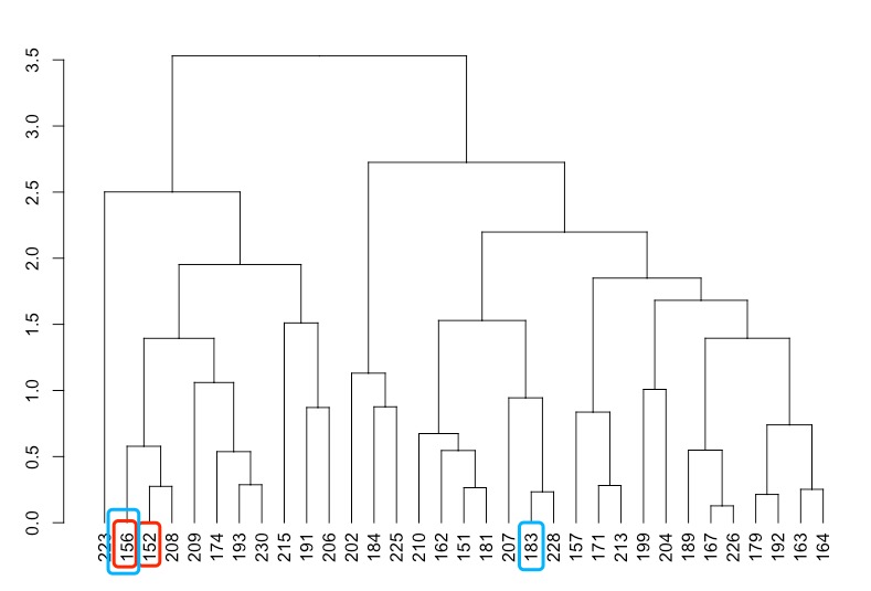
> seg.df[c(156, 152),] #similar |
as.dendrogram()
将不同的对象转换为树形结构对象。它可以接受多种不同的输入对象,包括:
- hclust 对象:从 hclust() 函数返回的聚类结果对象。
- agnes 对象:从 agnes() 函数返回的聚类结果对象。
- phylo 对象:从 ape 包中的函数返回的系统发育树对象。
- dist 对象:距离矩阵对象,表示观测点之间的距离或相似度。
使用 as.dendrogram() 函数可以将以上这些对象转换为 dendrogram 对象,然后可以使用 dendrogram 对象进行可视化、分析或其他操作。
2.3 Getting groups
> plot(seg.hc) |
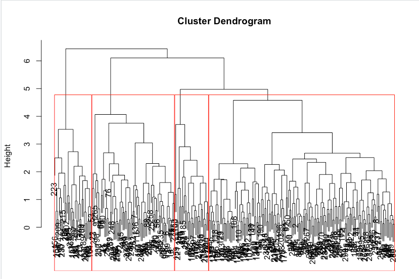
> seg.hc.segment <- cutree(seg.hc, k=4) #membership vector for 4 groups |
2.4 Describing clusters
library(cluster) |
> aggregate(seg.df, list(seg.hc.segment), mean) |
boxplot(seg.df$income ~ seg.hc.segment, ylab = "Income", xlab = "Cluster") |
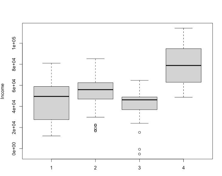
boxplot()
绘制箱线图,是一种常用的统计图形,用于显示一组数据的分布情况,包括中位数、四分位数、极值等。
箱线图
箱线图(Boxplot)是一种常用的统计图形,用于显示一组数据的分布情况。它提供了关于数据分布、中心位置、离散程度和异常值等方面的直观信息。箱线图通常包括以下几个部分:
-
箱子(Box):箱子由两条水平线段组成,分别表示数据的上四分位数(Q3)和下四分位数(Q1)。箱子的中间线表示数据的中位数(Q2)。
-
须(Whiskers):须延伸出箱子的两端,通常由直线或线段表示。须的长度通常是箱子高度的1.5倍的四分位距(IQR = Q3 - Q1)。须的端点通常是最大非异常值和最小非异常值,但具体的定义可能因数据分布而异。
-
异常值(Outliers):在箱子的须之外的数据点被视为异常值,并单独绘制出来,通常以圆圈或星号表示。
箱线图的绘制过程通常涉及以下步骤:
- 计算数据的描述性统计量,包括最小值、最大值、中位数、四分位数等。
- 根据计算的描述性统计量绘制箱子和须。
- 根据数据中的异常值绘制异常值。
- 添加额外的注释和标签,使得图形更加清晰易懂。
箱线图可以用于比较不同组之间的数据分布情况,检测异常值,以及观察数据的离散程度。它是一种简洁而有效的可视化工具,适用于各种类型的数据分析和探索。
3. Mean-based clustering: kmeans()
3.1 Clustering
> set.seed(96743) |
3.2 Describing clusters
> aggregate(seg.df, list(seg.k$cluster), mean) |
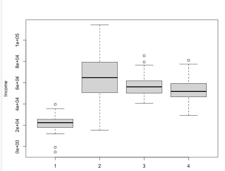
boxplot(seg.df$income ~ seg.k$cluster, ylab = "Income", xlab = "Cluster") |
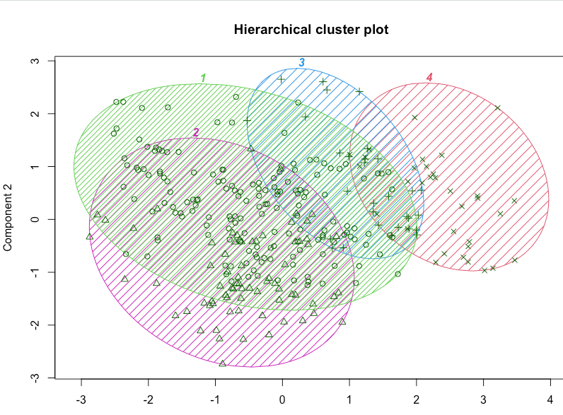
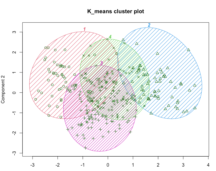
clusplot(seg.df, seg.k$cluster, |
这可能暗示了一种商业策略。在当前情况下,例如,我们看到第二组在一定程度上有所区别,并且拥有最高的平均收入。这可能使其成为潜在宣传活动的良好目标。还有许多其他策略可供选择;关键点在于分析提供了值得考虑的有趣选项。
k-means分析的一个局限性是需要指定聚类的数量,并且很难确定一个解决方案是否比另一个更好。如果我们要对当前的问题使用k-means,我们将重复分析k=3、4、5等,并确定哪个解决方案对我们的业务目标最有用。
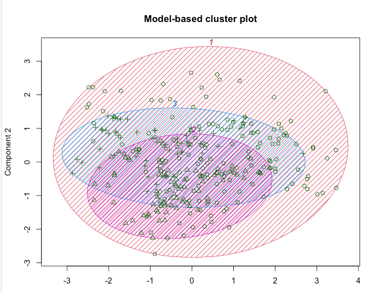
4. Model-based clustering: Mclust()
关键思想是观察结果来自具有不同统计分布(例如不同的均值和方差)的群体。算法试图找到最佳的一组这样的潜在分布,以解释观察到的数据。
4.1 Clustering
> library(mclust) #install if needed |
结果显示,数据被估计为具有三个大小不同的聚类,如表所示。
我们还看到对数似然信息,我们可以用它来比较模型。例如,我们尝试一个四个聚类的解决方案。
对数似然(log-likelihood)是统计学中用于评估模型拟合优良度的一种常用指标。它通常用于描述一个模型对观测数据的拟合程度有多好。对数似然值越高,表示模型对观测数据的拟合越好。
具体来说,对数似然值是在给定模型参数的条件下,观测数据出现的概率的对数。对于给定的观测数据集,我们可以将观测数据视为从一个概率分布中独立地抽取得到的样本。然后,对数似然值表示了在给定模型参数的条件下,观测数据出现的可能性大小。对数似然值越高,表示观测数据出现的可能性越大,即模型拟合效果越好。
在实际应用中,对数似然值通常用于比较不同模型的拟合效果。我们可以对同一组观测数据使用不同的模型进行拟合,并计算每个模型的对数似然值。然后,通过比较对数似然值的大小,我们可以确定哪个模型对观测数据的拟合效果更好。
需要注意的是,对数似然值通常是负数。这是因为对数似然值是一个概率的对数,而概率的取值范围是0到1之间。因此,对数似然值越大,表示概率越接近于1,而对数似然值越小(即绝对值越大),表示概率越接近于0。
> seg.mc4 <- Mclust(seg.df.sc, G =4) #specifying the number of clusters |
看起来分为3组时,对数似然估计更高。
4.2 Comparing models
> BIC(seg.mc, seg.mc4) |
3-cluster better.
4.3 Describing clusters
> aggregate(seg.df, list(seg.mc$classification), mean) |
Week2 Code
# install.packages ("readxl") |